Recently, I have been on-and-off trying to create some data visualizations for global COVID-19 data, as well as integrate it into my existing COVID tracker. I eventually settled on using Plotly, after a colleague showed me how easy it would be to integrate it into my existing Flask application.
The Data
Naturally, you can’t create data visualizations without data. For this example, we will be getting our data from the following API endpoint:
https://api.covid19api.com/total/country/<country_name>
This endpoint will show the total amount of confirmed cases, deaths, recoveries, and other data, starting on the date of the first confirmed case. The raw JSON data extracted from that endpoint will look like the following:
[
  {
    "Country": "<country_name>",
    "CountryCode": "",
    "Province": "",
    "City": "",
    "CityCode": "",
    "Lat": "0",
    "Lon": "0",
    "Confirmed": 0,
    "Deaths": 0,
    "Recovered": 0,
    "Active": 0,
    "Date": "2020-01-22T00:00:00Z"
  },
  ....
]
Because the JSON data is neatly organized as a list of associative arrays, we can easily load the data into a Pandas DataFrame, and apply the necessary manipulations to generate our graphs.
Creating the Visualizations
To generate multiple different visualizations, or “plots”, we will create a nested function inside our Flask route. The result route and graph generating function will look like this:
@app.route("/graphs/<string:country>")
def country_graphs(country):

    # Method to generate plots
    # "field" param can be equal to: "Confirmed", "Recovered", or "Deaths"
    def gen_plot(country, field):

        # Define API endpoint, and fetch data
        endpoint = get(f'https://api.covid19api.com/total/country/{country}')
        data = endpoint.json()
        df = pd.DataFrame(data)
        dates = df["Date"]
        case_type = df[field]
        # Merge the "Date" and "Confirmed" fields into one df
        merged_df = pd.concat([dates, case_type], axis=1)

        graph_data = px.line(data_frame=df, x=df["Date"], y=df[field])
        graph_JSON = json.dumps(graph_data, cls=PlotlyJSONEncoder)

        return graph_JSON

    return render_template(
        "country_graphs.html",
        nation=country,
        cases=gen_plot(country, "Confirmed"),
        deaths=gen_plot(country, "Deaths"),
        recoveries=gen_plot(country, "Recovered")
    )
The above gen_plot() function extracts data from the appropriate endpoint, loads it into a DataFrame, merges the Date field with Confirmed, Recovered, or Deaths into a new DataFrame. By adding the field parameter to gen_plot(), we can consolidate what would have been three different functions for generating graphs into just one. The function also encodes and returns a JSON object that can be embed in HTML.
Now that we have our server-side logic sorted out, we can move on to our client-side code.
Rendering the Visualizations
In this project, I needed to do more than just create plots. I also needed to render them in HTML templates. To assist in this, Plotly also provides a client-side JavaScript library.
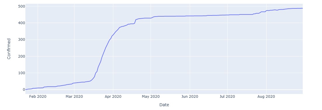
As an example, here is what a plot for the total case history of Taiwan looks like:
 Now, that’s flattening the curve.
And here is what the code for the relevant Jinja2 template looks like to render four different charts:
{% extends "layout.html" %}

{% block title %}{{nation}} Case History Graph {% endblock %}

{% block content %}

<div class="container">
  <h1 class="country_name">{{nation}} Data Visualizations</h1>
</div>

<br>

<h2>Cases History Chart</h2>

<div class="chart" id="cases">

<script>
  var graphs = {{ cases | safe }};
  Plotly.plot('cases', graphs, {});
</script>

</div>

<h2>Deaths History Chart</h2>

<div class="chart" id="deaths">

  <script>
    var graphs = {{ deaths | safe }};
    Plotly.plot('deaths', graphs, {});
  </script>

</div>

<h2>Recoveries History Chart</h2>

<div class="chart" id="recoveries">

  <script>
    var graphs = {{ recoveries | safe }};
    Plotly.plot('recoveries', graphs, {});
  </script>

</div>

<br>

{% endblock %}
Final Thoughts
Adding these plots to my COVID-19 Tracker has been my first serious foray into the world of data visualization, and I must say, it has been quite rewarding. Currently, I have only done some rather basic, cumulative visualizations, but I definitely look forward to doing more, in the future.